

How to Design Readable and Professional Looking Word Documents
Microsoft Word offers multiple features to produce, edit, and enhance your professional and amateur documents. However, you may sometimes not get the expected results, ignoring some steps that could have improved your document. For instance, you might not get the professional or high-quality documents you attempted to create with the existing features that you know.
To create an enriched document, you must know about the attributes of Word as well as the proper way to use them. The formats that you can convert your document into is crucial such as PDF to Word or JPG to Word by Duplichecker.com.
In this content, we will go through how you can develop your business and academic documents that look polished and professional.
Keep Your Document Simple And Less Wordy
You must keep document you are creating a simple one, depicting the true meaning it is supposed to represent. Words used in a document are the main source that will help to determine whether a document is a good or a bad one.

While creating any document, you must keep the main topic in your mind, and your content must revolve around it. You must remove any temptation which specifically is only inserted to catch the attention but is not relevant to the main topic. It should also be noticed that the document does not look congested with words. Reread the sentence which seems to be lengthy, and stay straightforward.
Select A Suitable Typeface
Before anything else, the first thing you must decide is about which typeface you will be using for your documents. According to the traditional information, Serif is the font which is best for printed materials as everyone can read it easily. On the other hand, when it comes to the digital screen, then sans-serif is the best font as it is easier to read it.
For serif fonts, you can use Palatino, Georgia, and Garamond whereas if you are using sans-serif. You may use Gill Sans, Arial, and Helvetica which are recommended too. Once you decide on your font, try to keep the same font in your whole document.
However, you may change the font, especially for headings or subheadings.
Use A Standard Size And Color For The Font
Generally, the font used in academic papers along with business reports have a size of 12 which is defined to be a decent font size when it is integrated with the guidelines of the margins, lines, and page size. Some reports which comprise a considerable amount of information might have a reduced size of 10.
For colors, it is suggested to make less use of light colors as they tend to be difficult to read on a white background. The result when printing will also differ as some printers might print the colors in a different tone and the cost of color printing is also higher than a plain black font. Bold and italic features for words to put the focus on can be used.
Use Standard Margins And Page Size
Almost all official documents are printed in the standard size of A4 paper which is measured to be as 8.5”x11”. This one size is always available no matter which printer you are using; hence it is beneficial for you to always create your document in this size.
When it comes to margins of the page, keep the margin of 1” on every side of your page as it allows you to attach any written annotation in your document and also gives the best line lengths for good readability.
Align Your Paragraphs From Right To Left
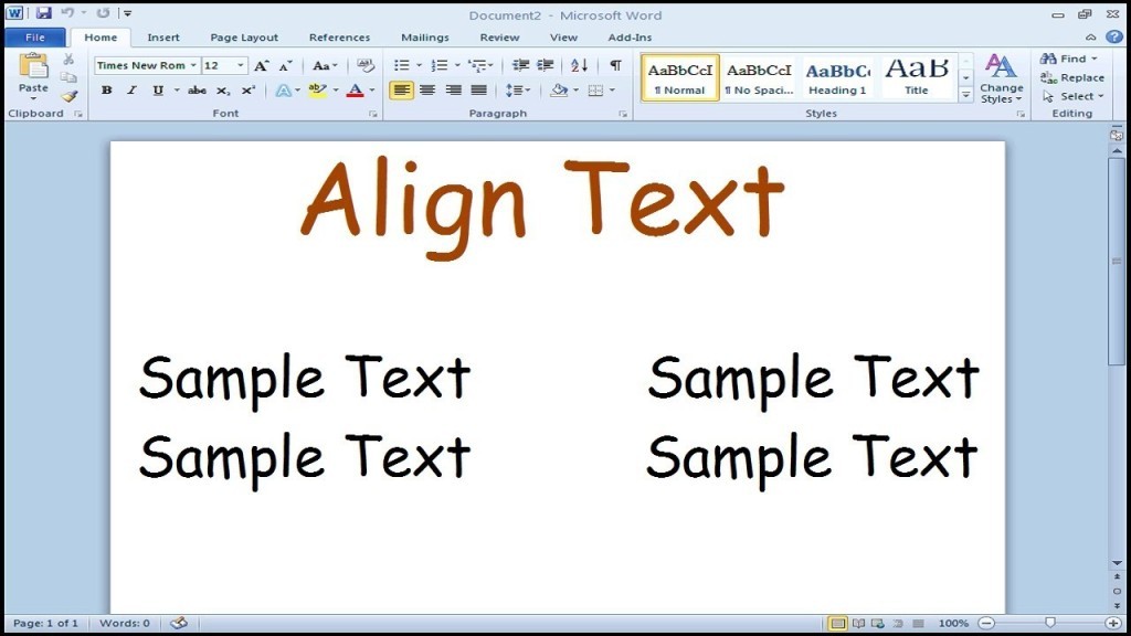
You might want to use the alignment which you see in most of the novels, textbooks, and newspaper, but when it comes to academic documents and office, then it is not a good choice. It might seem to be more formal as well as clean.
Left alignment on the written material leaves uneven edges on the right side of your paragraphs but keeps a good space between words no matter which typeface you are utilizing, and hence it results in the better reading experience. Whereas if you use the other alignment, then your document will look ugly as well as distracting to the readers.
Insert Pictures In Between Paragraphs
It looks suitable to insert pictures inside the paragraphs where necessary and write the text around it. However, it merely can hurt the readability experience, especially of reports.
The best choice for the images of graphs, tables, and different charts is to insert those pictures in between paragraphs, and you must make them center aligned. It assists the captions in standing out, and the images will be clearly displayed as there will be no text around them.
By following these tips, you can easily create the documents for your business and academic purposes as professional and readable as it gets.